Toronto

SMALL CURES ART SHOW 2018 by Shingo Shimizu

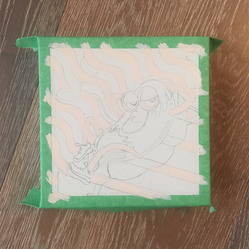
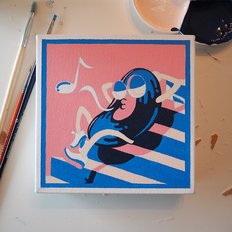
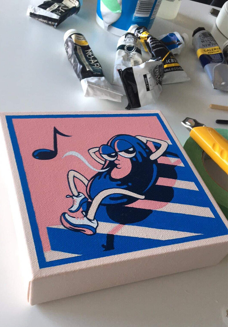
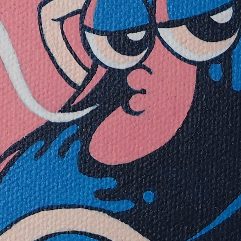
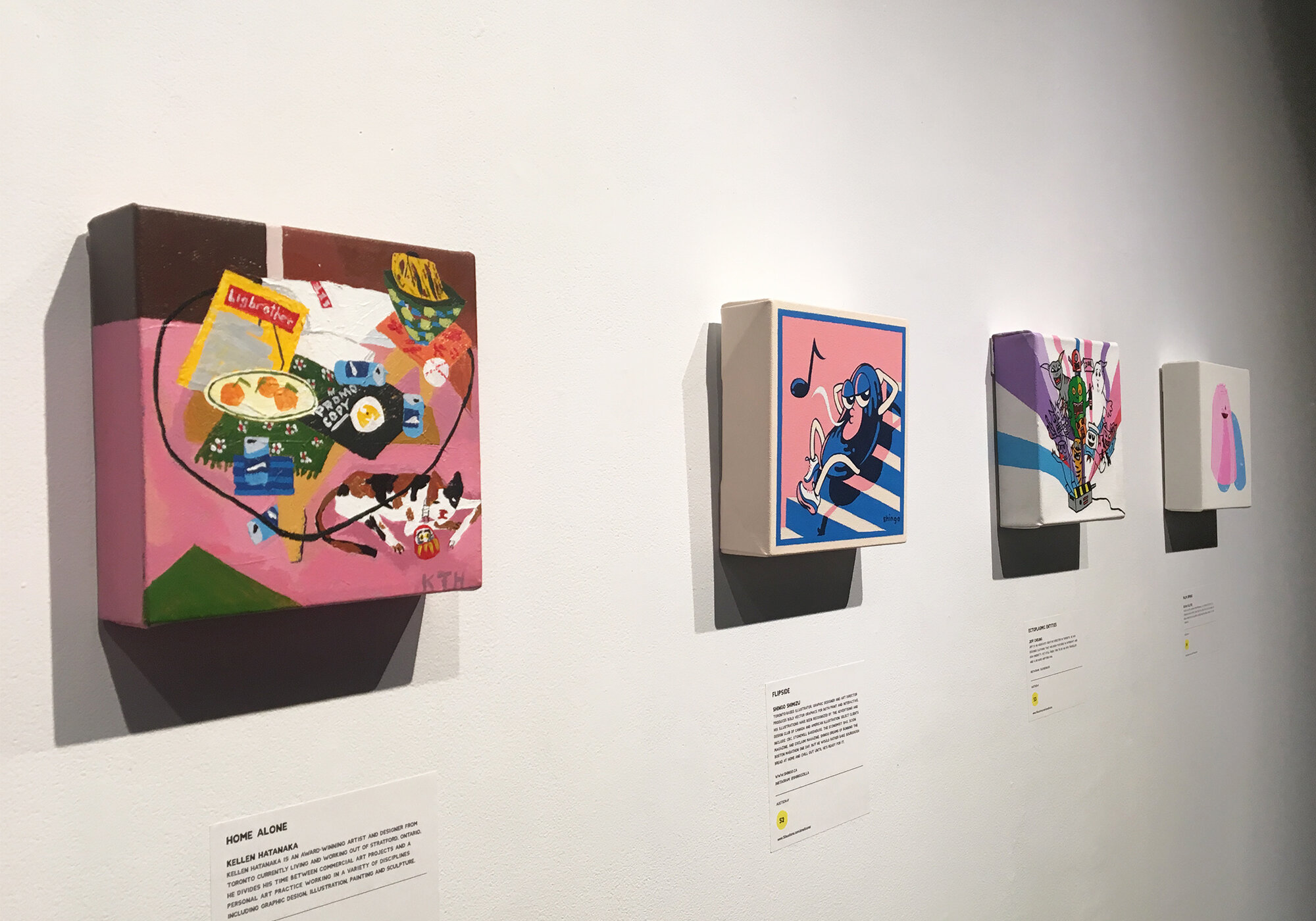
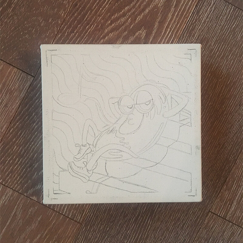
Only managed to squeeze in this little 6 x 6” canvas painting completed for Small Cures Art Show & Auction 2018.

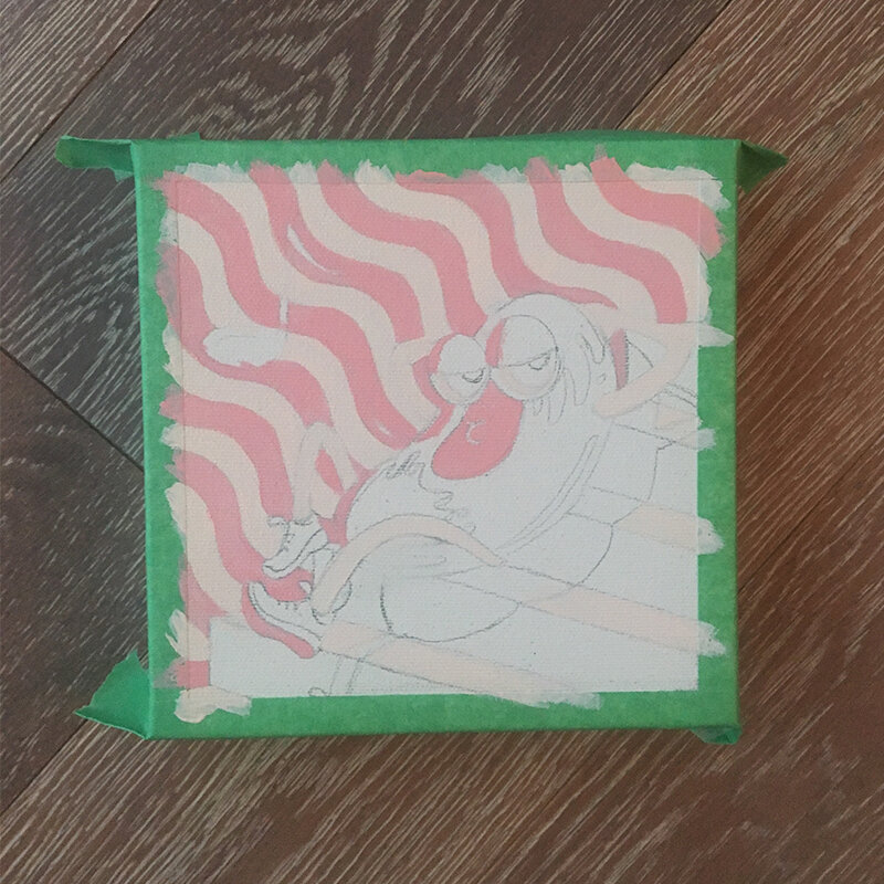
In the beginning I painted a version with wavy lines in the background. For some reason I had some acrylic medium kicking around and thought I’d give it a go. Long story short: paint got all goopy because I was suppose to dilute the medium with water before mixing. Gotta make mistakes…at 3am.

Luckily they gave me a spare just in case I was a little ambitious. On the second go round I simplified and punched up the peachy pink. Also originally I wanted to do a cassette gal and cd guy of course, but…it’s been done so many times (YES, so is vinyl). I still LOVE vinyl, but yes it’s another overdone visual…I was only in the mood for this last one sexy record, and that’s it. Hopefully next year I’ll get back to drawing more people. As it was a one off, but spent a few late nights with it. I grew fond of this little fellow. Just look at that face! Anyhow it was for charity. It sold for $350 at the end of the night! Mission accomplished. zzz.

Scion Magazine - Issue 4 (the Music Issue) by Shingo Shimizu

Apologies, for not posting for a while everyone! It's been quite busy since this project ended (which is SO great), but it means I have no time to write a proper post. 

Scion Magazine Issue 4 starts off a new format: 48 page magazine at 10.25" x 14.5" but still printed on the matte recycled stock. It's also the first of 'themed' issues, starting with 'the Music Issue'. Yes it was very exciting: bigger, more pages, and lots of music content! I thought I'd actually get quite tired of drawing speakers, records, or headphones...but surprisingly I didn't! It makes for great practice too~. 

Anyhow, more stuff being posted this week! Seriously. :)

CHECK IT OUT HERE!

Sneak Peek: Scion Issue 4 'Music Issue' by Shingo Shimizu

Over the last few months I remember my response to the usually welcoming line, 'Shingo I have a great project for you!' was turned down with,'I can't, I'm sorry I'm very busy.’ That wonderful project I've been working on for the last three months was the fourth issue of Scion magazine with Editor-in-Chief, Lisa Marie Chen. I was responsible for the overall art direction, with duties on illustration and design as well.

It has now been printed, and will be distributed out to stores very soon across Canada. Pretty exciting!

You will notice (photos coming soon), that the format has changed. Previous issues measured at a tiny 5.5" x 7.125". Scion magazine is now a whopping 10.5 x 14.5" on the same bright white recycled stock, and 48 pages. 

For every issue, we try to give a little ‘something something’ for the reader. So to commemorate this music focused issue, there is a pullout Scion branded 'gig poster'.

Stylistically there is more range. I went looser with the design template, at the same time showcasing a broader range of style (minimal, hand drawn, hand written, hand made, etc.), which is what I was hoping to achieve. It gives the magazine a ‘warmer’ feel than the previous issues. Kind of like the feeling when you flip through a pile of eye catchy record covers. It also features some great photography by Andy Lee, as well as some great collage illustrations by Rachel Kennedy.

So without further ado, it is with great pleasure, I give you a glimpse of Scion magazine Issue 4, the 'Music Issue'.

Cover-front-500px.jpg
record-poster-600px.jpg

Illustration for the Genteel 4 by Shingo Shimizu

New illustration for The Genteel i just finished, published today! 

Haute or Not?

by: Chere Di Boscio 

Despite their astronomical price tags, haute couture creations are rarely profitable, and only a handful of women can afford to buy them anyway. So what's the point?

Read Article >

This assignment was definitely the most fun for sure. Being able to check out the Alexander McQueen show at the MET last year was such a huge inspiration for me creatively. I mean I've seen a lot of 'fashion' on TV and in books through high school and at OCAD (was hardcore into Issey Miyake of course). But to see them in person...at the MET...after a 2.5 hour line up...really blew me away. Since then, my appreciation for craftsmanship has grown immensely. Currently I'm really digging the work of Katsuya Kamo. Check out his paper sculptures (hats and stuff) coupled with Lagerfeld's designs for Chanel's 2009 Couture show here.

Illustration for The Genteel 2 by Shingo Shimizu

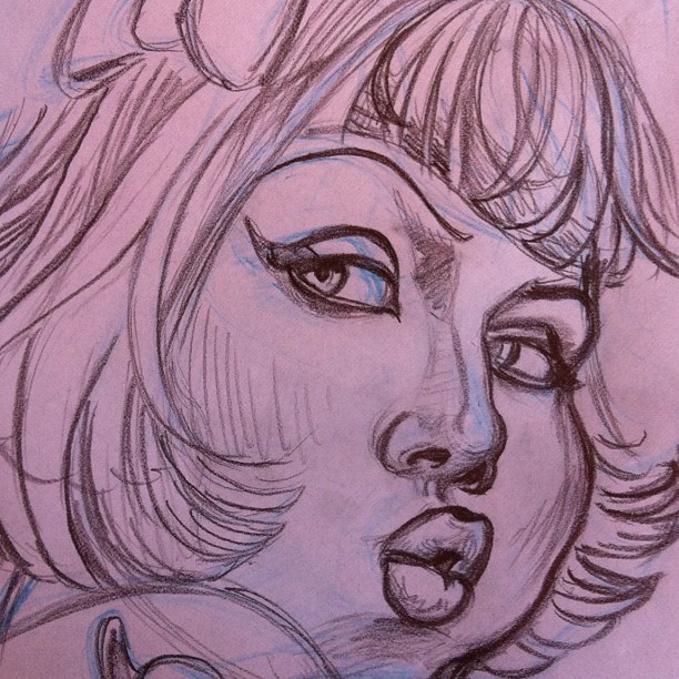
Also just finished this one with a new look and feel (for me) for the wonderful folks at The Genteel! This time around I got to get a little drawing time with Twiggy's face. (I need to definitely draw more of her.)

The article is not about her, but more about 'mature' models in the fashion world, and why '...ageing and fashion have - until now - been such odd bedfellows in the first place.'

A New Age in Fashion

by: Erin Ridley 

With the public smitten by more mature looks and the industry following suit, one wonders why ageing and fashion have - until now - been such odd bedfellows in the first place.

Read Article >

Illustration for The Genteel 1 by Shingo Shimizu

Just finished a new illustration with a new look and feel (for me) for the wonderful folks at The Genteel! It's fun to get back to drawing more fashionable subjects.

If you haven't checked their site yet, definitely do if you love a good read. Oh and there will be more work by yours truly there of course. :)

The Importance of Being Fashionable

by: Erin Ridley 

Women think about fashion 91 times a day. For those who have "clothes on the brain," why is fashion so important to us. 

Read Article >

@La_carnita #UNO #Artshow Submission Complete by Shingo Shimizu

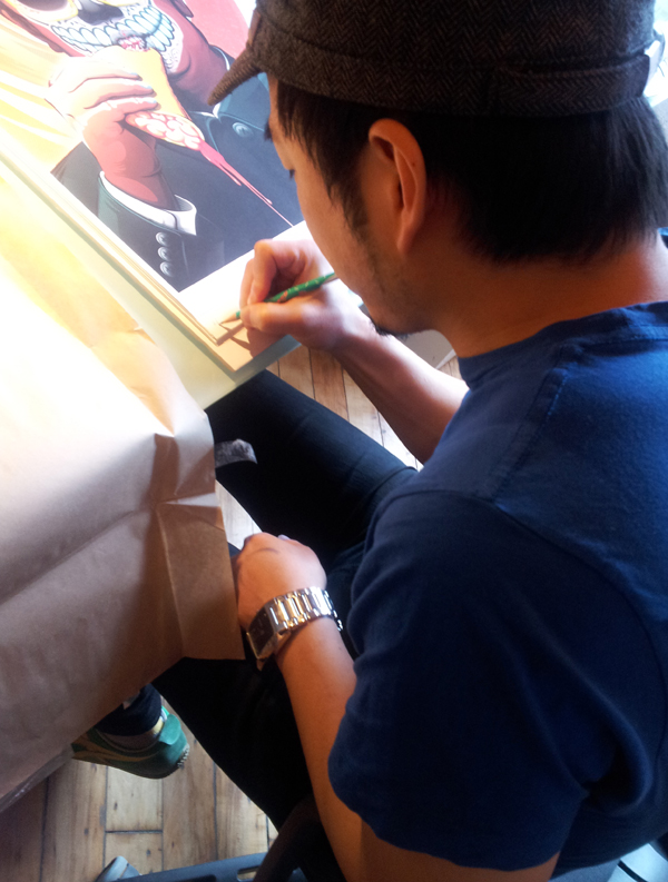
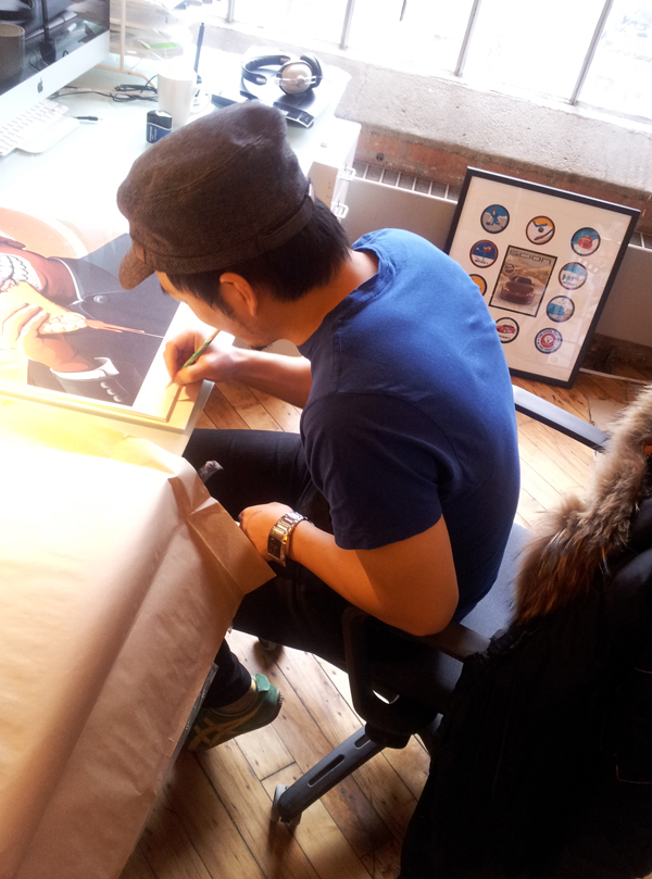
So I just finished signing my 18" x 24" giclee prints (will be sold at the UNO show on friday) and dropped them off at @La_Carnita!!!

YES, you heard right. New prints will finally be available, printed with the highest quality using Epson Stylus Pro 9900 (scroll down below for more info on Epson Technology) on Epson Matte paper.

Relaxing now eating a grilled chicken bahn mi sandwich from Bahn Mi Boys, and an americano from Sense Appeal. It is a good day today. 


ps: thanks to Richardson DX for the photos!
 

Could that be the new issue of Scion Magazine Issue 3???
 

Epson Technology

To produce our archival prints with amazing colour integrity, gloss-level, and scratch resistance we use Epson Stylus Pro 9900.

Representing Epson's next generation, the Epson Stylus Pro 9900

(44 inch) incorporate the latest achievements in photographic ink jet technology. By combining the precision of the MicroPiezo TFP™ print head with the extraordinary performance of Epson Ultrachrome® HDR Ink, the newest generation of Epson Stylus Pro printers continue to represent a level of technology unprecedented in Epson's history. 

Epson Ultrachrome High Dynamic Range (HDR) represents the latest generation of pigment ink technology. Now utilizing 10 COLOURS (including an all new ORANGE and GREEN) Epson Ultrachrome HDR Ink produces the widest colour gamut ever from an Epson Stylus Pro printer. Even more remarkable, when combine with the new Epson AccuPhoto™ HDR screening technology, Epson has once raise the level of print quality, while setting a new benchmark standard for photographic reproduction.


Epson Accuphoto™ HDR Screening

*- Advanced ten-colour screening algorithm resulting in prints with superior colour and clarity.

*- Maximum resolution of 2880 x 1440 dpi for incredibly sharp text and line art.

*- Produces extremely fine blends and photographic transitions.

*- Extremely accurate highlight-to-shadow details.

*- No visible photographic graininess due to the printing process.

*- Ensures consistent color balance regardless of the viewing light source.

*- When combined with the precise dot placement accuracy of the Epson MicroPiezo TFP print head, overall photographic print quality is dramatically improved.


EPSON ENHANCED MATTE:
Archival quality 76 years approximately
Flat matte surface provides the optimum photographic platform.
Heavyweight stock delivers true photographic feel.
High colour gamut yields remarkable colour reproduction.
Epson Archival Ink compatibility ensures exceptional lightfastness ratings.

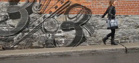
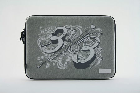
Graphics for Three Thirds Bags by Shingo Shimizu

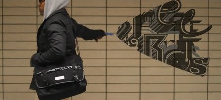
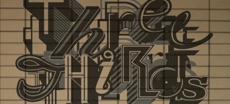
Three Thirds Bags approached me to design a few graphics for their laptop sleeve cases for them a while ago. You may not have heard of them yet. They're a bit under the radar at the moment. But I'm sure they'll blow up soon, as their laptop bags are amazing. My Gravis bag is looking pretty lame...it's definitely time I get a new bag. Anyhow take a look at their products here!

The first design I did has a random font look, and the second one was inspired by pinball graphics. Both are featured in their promo video (below). Check it out!


'Pinball' Notebook sleeve.

Video directed by Daravong Thongsavath.


Interview by Hermann & Audrey by Shingo Shimizu

Photography by Jalani MorganPhotographers much like Illustrators, make people look much better than they do. I don't think I'm photogenic. To be honest, I'm pretty squeamish when having my photo taken on a set. But I have a lot of respect for photographers. Unlike, us illustrators who may need a couple days to capture a moment, they do it almost instantly. They also have to be able to direct people, so their subject feel comfortable in front of the camera. Pretty cool. Oh and they can make a raccoon look human.

I rolled onto the set that day, pulling an all-nighter, because of some crazy deadlines. Despite the sleepy raccoon situation, my mood was happy because of the great company on set: Kimberley Yun, Willie Tsang and of course Jalani Morgan.

I had the opportunity to meet the talented photographer from the Hermann & Audrey collective, and kept in touch ever since. Thank you for the interview Jalani!

Read the interview