Design

Exclaim! magazine by Shingo Shimizu

Started as Art Director for Exclaim! magazine in spring of this year. Here are a few covers and feature stories I designed.

From issue to issue, I am usually learning about or listening to a new band or artist that is new to me. The process always involves me either YouTubing their videos, or Wikipediaing their bios. I wonder what music magazine Art Directors did back in the day before the internet on bands they didn't know? I imagine many poor librarians having to archive newspaper and magazine clippings...oh internet I love you. 

Anyhow, we also commission illustrators for portraits for our 'Reviews' page. I've also been enjoying those quite a bit. I will post some of those soon as well.

For now, check them out here!

Scion Magazine - Issue 4 (the Music Issue) by Shingo Shimizu

Apologies, for not posting for a while everyone! It's been quite busy since this project ended (which is SO great), but it means I have no time to write a proper post. 

Scion Magazine Issue 4 starts off a new format: 48 page magazine at 10.25" x 14.5" but still printed on the matte recycled stock. It's also the first of 'themed' issues, starting with 'the Music Issue'. Yes it was very exciting: bigger, more pages, and lots of music content! I thought I'd actually get quite tired of drawing speakers, records, or headphones...but surprisingly I didn't! It makes for great practice too~. 

Anyhow, more stuff being posted this week! Seriously. :)

CHECK IT OUT HERE!

Sneak Peek: Scion Issue 4 'Music Issue' by Shingo Shimizu

Over the last few months I remember my response to the usually welcoming line, 'Shingo I have a great project for you!' was turned down with,'I can't, I'm sorry I'm very busy.’ That wonderful project I've been working on for the last three months was the fourth issue of Scion magazine with Editor-in-Chief, Lisa Marie Chen. I was responsible for the overall art direction, with duties on illustration and design as well.

It has now been printed, and will be distributed out to stores very soon across Canada. Pretty exciting!

You will notice (photos coming soon), that the format has changed. Previous issues measured at a tiny 5.5" x 7.125". Scion magazine is now a whopping 10.5 x 14.5" on the same bright white recycled stock, and 48 pages. 

For every issue, we try to give a little ‘something something’ for the reader. So to commemorate this music focused issue, there is a pullout Scion branded 'gig poster'.

Stylistically there is more range. I went looser with the design template, at the same time showcasing a broader range of style (minimal, hand drawn, hand written, hand made, etc.), which is what I was hoping to achieve. It gives the magazine a ‘warmer’ feel than the previous issues. Kind of like the feeling when you flip through a pile of eye catchy record covers. It also features some great photography by Andy Lee, as well as some great collage illustrations by Rachel Kennedy.

So without further ado, it is with great pleasure, I give you a glimpse of Scion magazine Issue 4, the 'Music Issue'.

Cover-front-500px.jpg
record-poster-600px.jpg

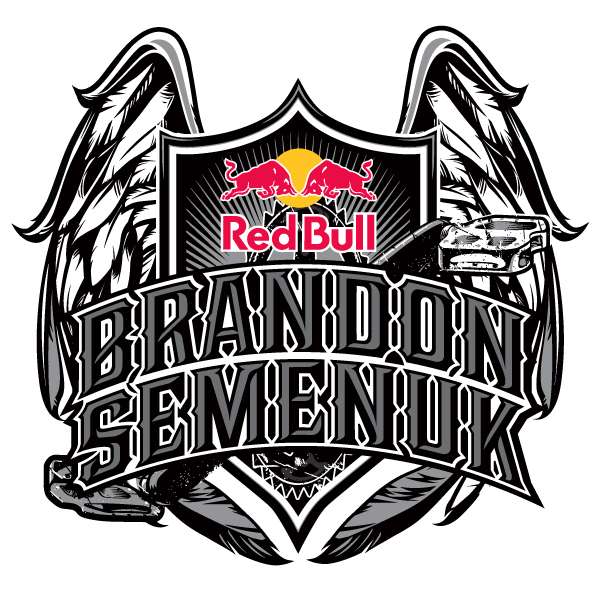
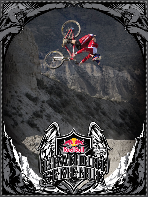
Logo and Poster for Red Bull District Rider: Brandon Semenuk by Shingo Shimizu

Just finished this last week. Logo and poster design for Red Bull District Rider: Brandon Semenuk. If you haven't heard of him yet, he's pretty much one of the top professional mountain bikers in the world.


Check out the teaser trailer for this amazing looking movie called, 'Life Cyles'. 
Life Cycles OFFICIAL Trailer from Life Cycles on Vimeo.
 

If you haven't seen Brandon Semenuk in action before, definitely check some more videos of him in action HERE and HERE! He really gets some serious air time. Insane!


Cover Art For New Puzzle EP by Shingo Shimizu

Happy New Year! Hope you all had a great holiday. :)

I know I did over on the west coast, finally getting into snowboarding. Now where to go boarding after Whistler, when you live in Toronto? hmmm.

Being fully relaxed over the holidays, it's nice hit the grind again. Is it me, or is 2011 moving VERY FAST? That being said, there are lots of interesting projects on the horizon. Almost finishing a series off with my photographer friend, Jalani Morgan. So check back soon!

The illustration above was slightly reappropriated from "Full Circle" for Puzzle's new EP, "Polysnacks". You can listen and purchase the EP here.


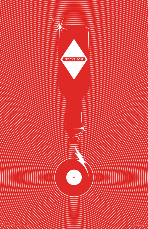
Limited Edition Hot Sauce Posters & CD Giveaway! by Shingo Shimizu

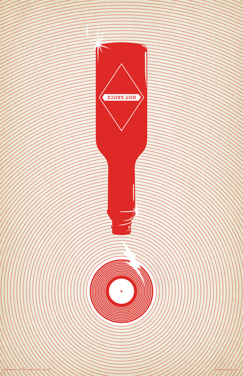
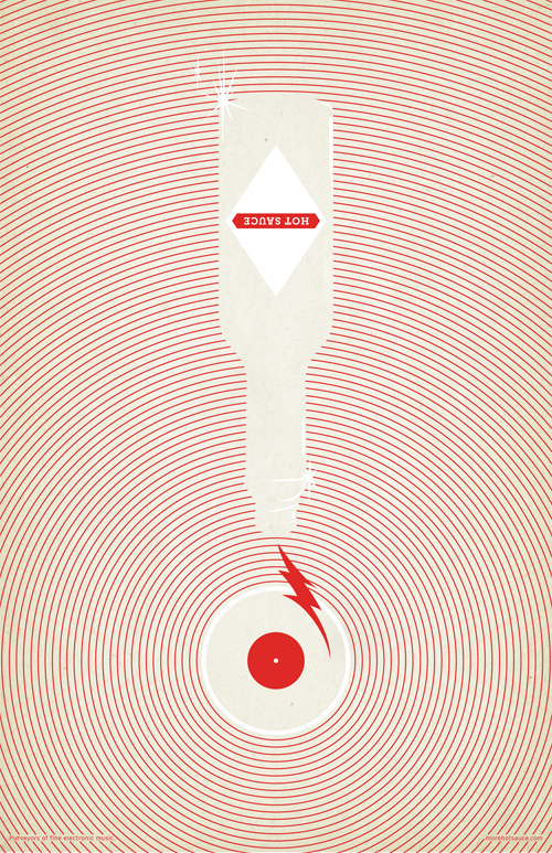
So some of you may know, that I will be throwing a party with my Hot Sauce crew (We're not hardcore connoisseurs of the sauce). For about a year and a half or so, we've been running a music blog about our favourites in the electronic music scene. Obviously we all do it just out of the love for the music and want to share it with you.

We are finally set to launch a 'Hotsauce 2.0' version of the blog. It will feature much more content than before: artist interviews, reviews, videos, our DJ mixes, and exclusive guest DJ mixes. To commemorate this, please join us as we throw down HOT SAUCE 2.0 LAUNCH PARTY at Tequia Bookworm Friday November 12, 2010! Come early for free giveaways!


HOT SAUCE 2.0 LAUNCH PARTY!
FRIDAY NOVEMBER 12, 2010

Location:
Tequila Bookworm (upstairs!)
512 Queen St. West (map)

Djs:
DJ Shingo (listen)
MissRuckus (listen)
urbansteve (listen)

Free Giveaway!
First 27 people in will receive:
1. NEW HOTSAUCE MIX CD! (this was a lot of fun to record)
2. LIMITED EDITION PRINTS (11 x 17")! Only 9 copies of 3 different prints available. (see below) 

Drink Special!
If you were one of the lucky people who got one of the Hot Sauce buttons (see below) from Tequila, Slinky Music, or Magic Pony, then you'll get $4 shots all night!


Hope to see you all there!
:)


Graphics for Three Thirds Bags by Shingo Shimizu

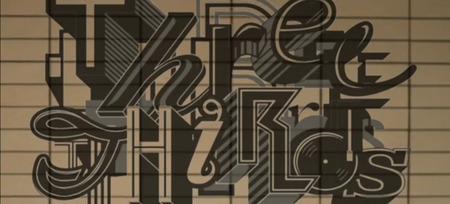
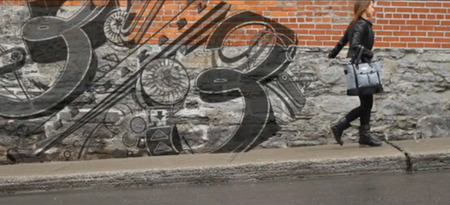
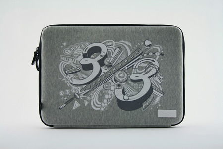
Three Thirds Bags approached me to design a few graphics for their laptop sleeve cases for them a while ago. You may not have heard of them yet. They're a bit under the radar at the moment. But I'm sure they'll blow up soon, as their laptop bags are amazing. My Gravis bag is looking pretty lame...it's definitely time I get a new bag. Anyhow take a look at their products here!

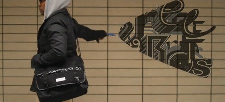
The first design I did has a random font look, and the second one was inspired by pinball graphics. Both are featured in their promo video (below). Check it out!


'Pinball' Notebook sleeve.

Video directed by Daravong Thongsavath.


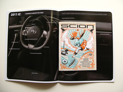
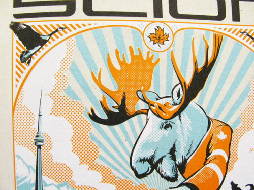
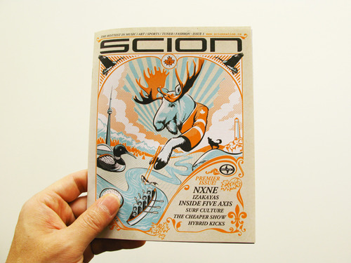
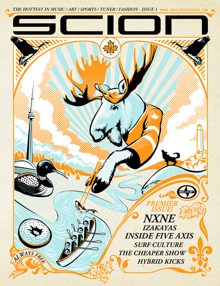
Scion Canada Lifestyle Magazine Issue #1! by Shingo Shimizu

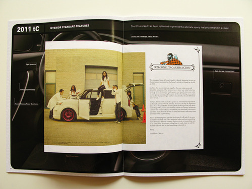
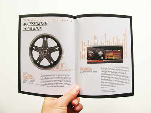
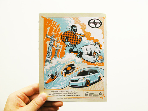
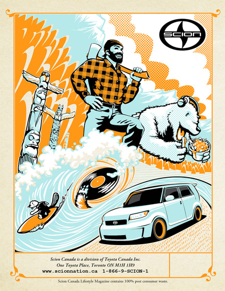
It's been a very awesome experience with this project, as I was not only responsible for the front and back cover illustration, but the Art Direction and a lot of the design of the magazine as well. This 6 colour, 40 page, little magazine measures 5.5" x 7.125", and will be inserted into the back of Scion's car catalogue brochure. It is printed on a rather nice recycled stock as well. Look forward to pushing the design a lot further in Issue #2 which should be ready by early next year, 2011.

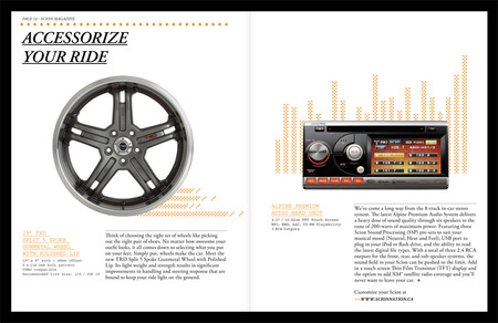
Check out the cover and a few spreads from Issue #1 below of Scion Canada Lifestyle magazine.


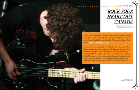
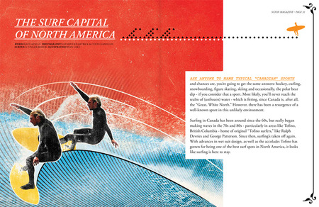
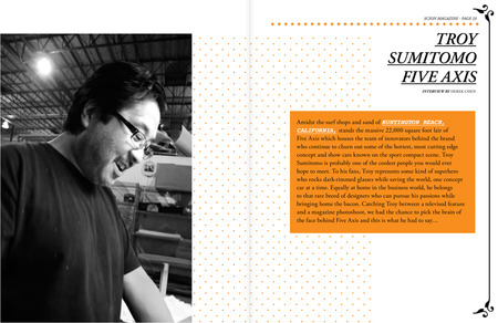
Feature on NXNE festival in Toronto. Awesome illustration by Ryan Lake.Feature on Troy Sumitomo of Five Axis.

One of my favourite spreads.

The original design featured a Mountie, instead of the lumber jack. It is actually quite difficult to get an image of the mountie approved, as it has to be approved. So always have a plan B. FSC logo to be inserted into the bottom right corner.

Download full version (PDF) of Issue #1 here!


Vintage graphics for Mini Mioche T-Shirts by Shingo Shimizu

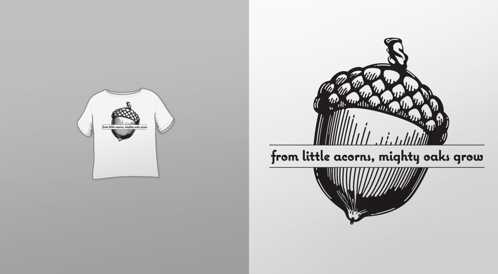
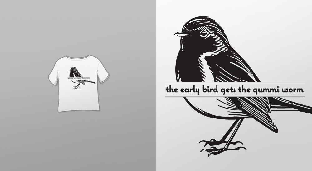
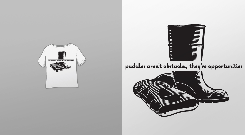
Yes it's another collaboration with myself and designer studio mate, Matt Bilewicz. One of his clients, Mini Mioche, a local organic baby clothing company requested graphics with a vintage feel. MM provided us with the quotes, I did the illustrations and Matt was responsible for the typography. There was also an umbrella graphic done in the same style, but it didn't make the cut unfortunately. The quote for the boots graphic, was originally for the umbrella, but in the end the client felt the boots were more appropriate for the words. So that change was made in the end. I still do think the umbrella graphic is nice. So if anybody needs a vintage umbrella graphic, let me know or let them know that I want to know.


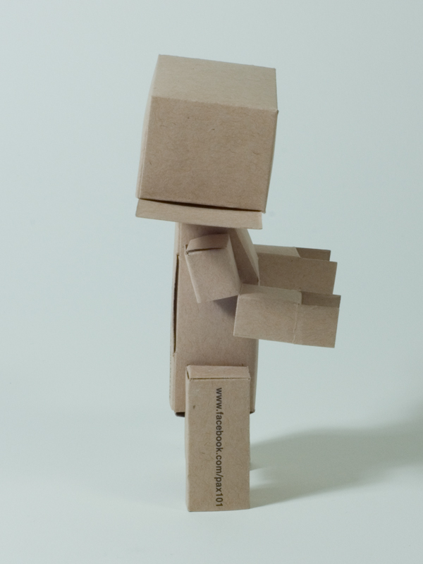
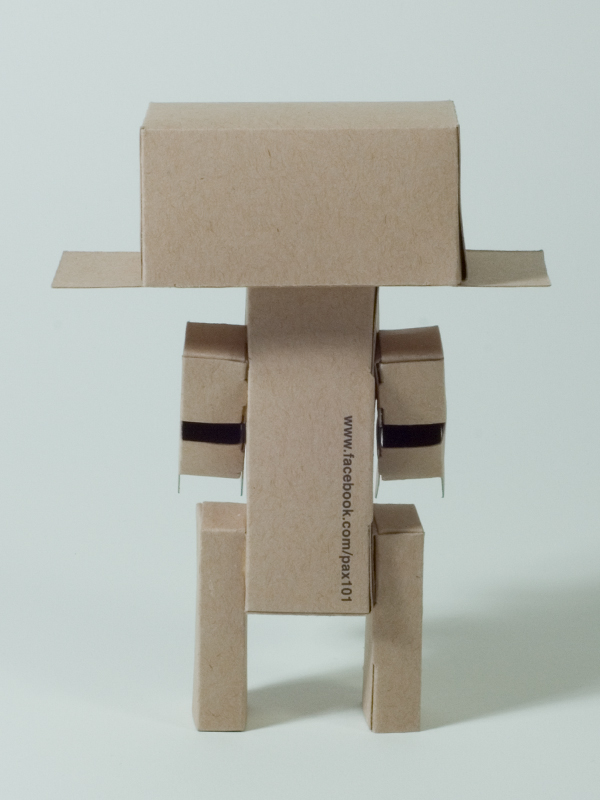
Pax 101: A peaceful cardboard robot by Shingo Shimizu

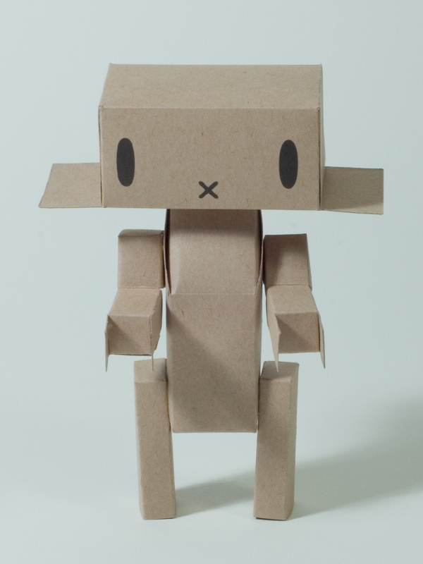
It's been a while since my last artwork update. I've been quite busy with a number of varied projects, especially with this character design called 'Pax', which was commissioned by The Hive. Built with a sheet of cardboard, Pax is a peaceful robot hoping to bring peace in the Middle East.

The final version is pretty close to what I envisioned. Except:

1) the original head side flaps were bent (so it could be more expressive), instead of the current stiff flaps-straight-out look, and

2) the original design required no glue for the joints, and it does currently. Other than that, I'm pretty pleased with the finished product.

More photos up of Pax in the Character Design gallery and below!


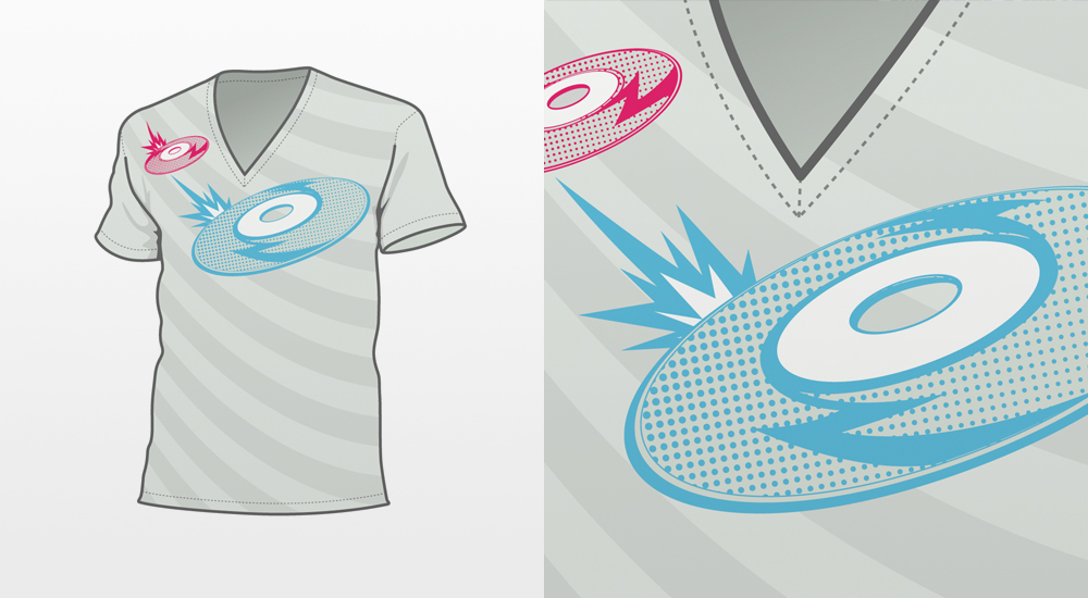
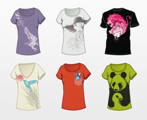
NEW! T-Shirt section is up! by Shingo Shimizu


Finally I've got around to compiling T-shirt designs I did over the last few years. It really takes a long time to compile, and it is adding a bit of weight to the site. Got to trim down the fat some time soon! Anyhow, please take a look, and let me know what you think! I will be posting some of my artwork onto T-shirts probably sometime in the near future, so check back soon. :)

Check it!