Editorial

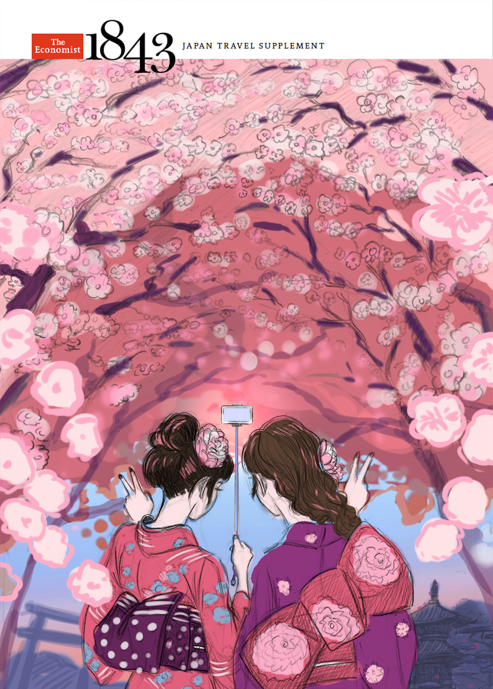
the Economist 1843 magazine by Shingo Shimizu

Hello Thursday.

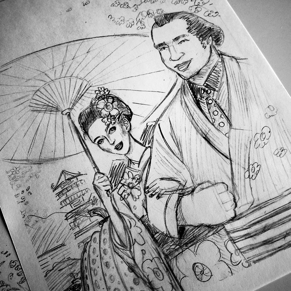
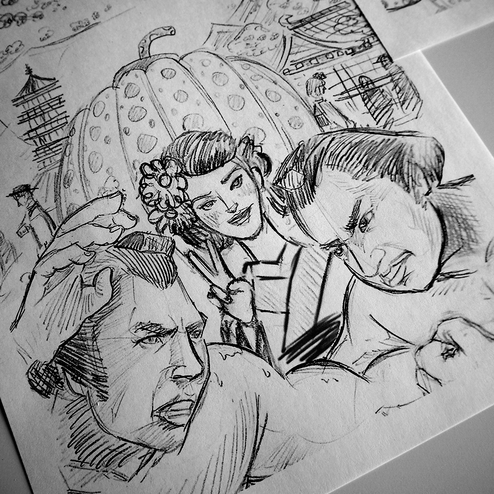
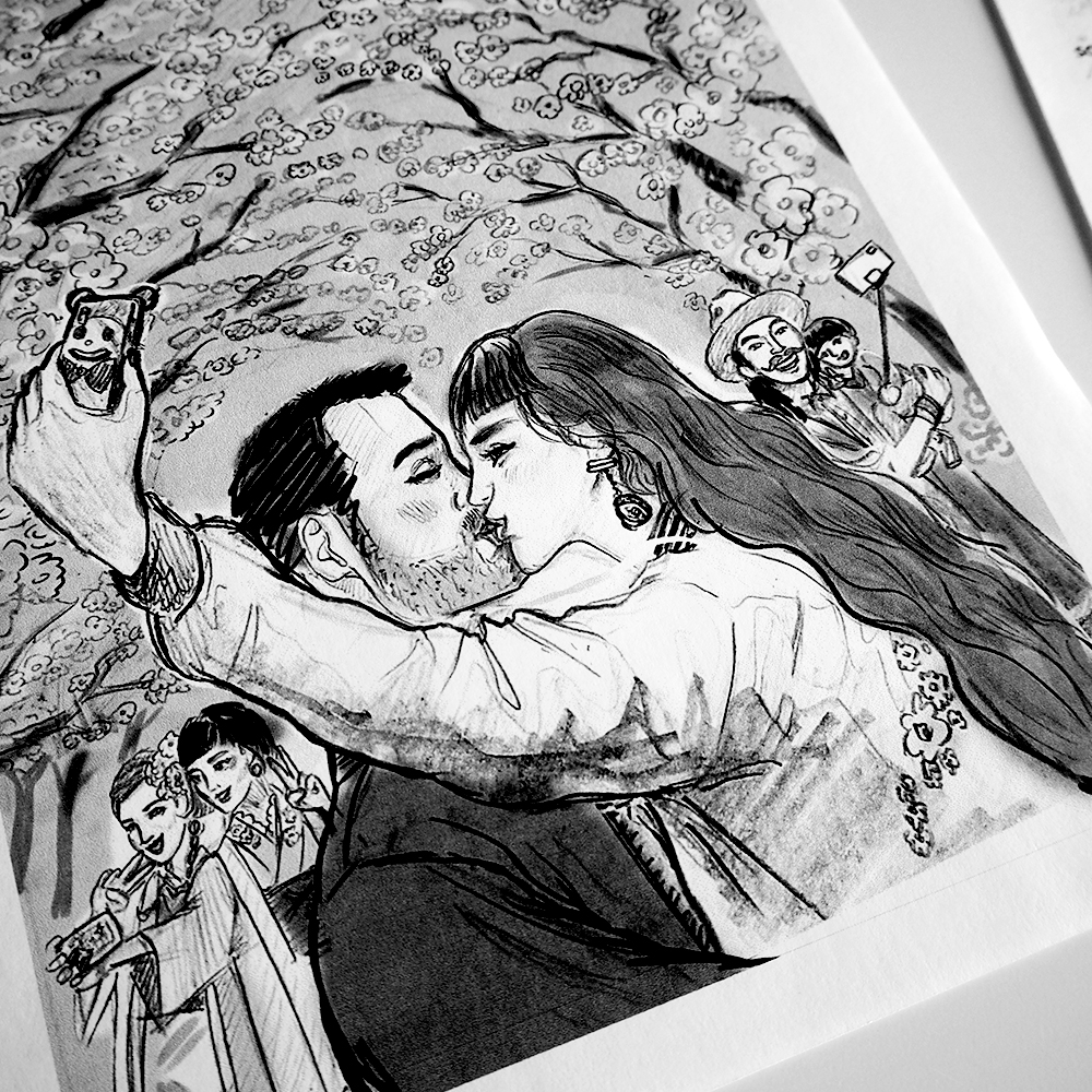
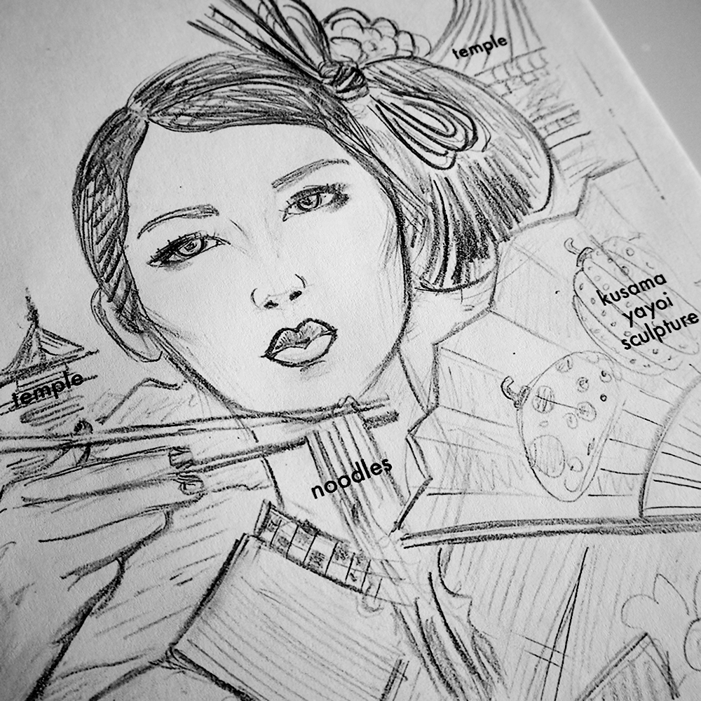
As I said, just getting around to updating my portfolio. I completed these illustrations for The Economist 1843's 'Japan Travel Supplement' earlier this year. Included below are a bunch of sketches that missed the mark, but I had fun with them, so I included those here as well.

Also got to draw a woman skier in a kimono for a spot illustration on the inside. Check it out below.

The final artworks can be seen here. Check it out! :)

Applied Arts Twice. 3x3 Twice. by Shingo Shimizu

It's been quite a while since my last post. Not that I've been one to post daily, as if it were my personal diary. Was away on quite the experience in Japan (which will be covered in the next issue 7 of Scion magazine).

Anyhow I am happy to announce that my work on the 'Northern Exposure' article in issue 5 of 'Scion magazine' was selected a few times for Illustration annuals and the 'Troy Sumitomo' (from Five Axis) portrait as well! 

'NORTHERN EXPOSURE'
ADVERTISING & PORTRAIT ILLUSTRATION
Applied Arts 2014 

'NORTHERN EXPOSURE' & 'TROY SUMITOMO'
PORTRAIT ILLUSTRATION
3x3 Illustration Annual no. 11

Saatchi & Saatchi Canada 
Executive Creative Direction: Brian Sheppard, Helen Pak 
Illustration: Shingo Shimizu 
Editor in Chief/Magazine CD: Lisamarie Chen 
Client: Toyota Canada

troy-sumitomo-shingo-shimizu.jpg

Scion Magazine - Issue 6 (Inside Issue) by Shingo Shimizu

Scion Magazine Issue 6 (Inside Issue) continues in the same format as issue #5: 48 page magazine at 10.25" x 14.5", printed on the matte recycled stock. I want to send a big shout out to the Scion team: Lisa Marie Chen (Editor-in-Chief), Olivia Truong (Designer / Illustrator), Rachel Kennedy (Designer), Shauna Roe (Writer), Sheraz Amin, and newcomers to the team: Joel Arbez (Art Director), Christian Buer (Designer / Illustrator), and Matt Antonello (Writer). Thank you for all your hard work!

With the cover, we decided to go with an illustrated execution. I won't get into the technicalities of this particular FR-S on the cover (it's been strongly influenced by my recent trip to SEMA and the Tokyo Auto Salon.). Anyhow, the theme being 'Inside', I'll admit it was quite difficult in honing into an idea that would convey this. The magazine was to be released at the Toronto Auto Show, so it was mandatory that a car be on the cover. Without overthinking the concepts of 'inside' and a car, we decided to keep the idea rather simple, and then push much harder on the execution. 

Each of the elements exploding out of the open hood refers to each one of the stories or ads in this issue. The back cover (again very simple), is the back of the FR-S, (inside of a tunnel) driving towards the opening (url). The illustrations are treated more 'graphic-like', coloured in only black, white, and 2 PMS (green & blue). The goal was to look 'wintery' without the typical wintery imagery or colour palette.

Inside the magazine, you'll notice that there are 5 car ads (with animal heads). These pages are all LAYAR activated, meaning they all play some fun video content. A big shout out to the team that worked on this: Joel Arbez, Christian Buer, Lisa Marie Chen, Clay Stang (Photographer), Reynard Li & Rico Moran (Assistants), Matt Antonello, Kyle McNair (Video Editor) and Pat Cyr. Some of us got to be photographed with a mask on. Can you guess who's who?

Last but not least, there is also a fun video of designer, Matt Law (ML24) drawing a car from start to finish in his story, in which he is interviewed by none other than Troy 'Five Axis' Sumitomo! Let me know what you think of the latest. 

CHECK IT OUT HERE!

scion-magazine-6-cover-1.jpg

Scion Magazine - Issue 5 (the Storytelling Issue) by Shingo Shimizu

Scion Magazine Issue 5 (the Storytelling issue) continues in the same format as issue #4: 48 page magazine at 10.25" x 14.5", printed on the matte recycled stock.

This is definitely my favourite of the covers for the magazine. Not only is it very different from what we've produced thus far, it's our first photographed cover (issue 3 only the cars were photographed, so that doesn't count). It also probably looks the simplest, but it wasn't! There was so much prep work beforehand in painstakingly designing and building the covers (which would not have been possible without our fab interns Olivia Truong and Ilona Fiddy), and then beautifully photographed by Andrew B. Myers. Also thanks to Lisa Marie Chen, my partner in crime on every issue, the Editor-in-Chief.

The textures and patterns are a combination of papers from 'the Paper Place' on Queen West in Toronto (I could totally just spend the day here...), as well as our own designs. The book spine designs reflect each of the stories in the magazine, as it works as a Table of Contents page as well. The challenge I face is always the bilingual factor, (as it is a Canadian magazine) with an English and French version. The type was added in post. To bring in 'car content' we put the 'Scion Book' on the front cover, reveals that it's Scion coffee table book on the back cover, with a Scion tC on its cover. 

CHECK IT OUT HERE!

Scion Magazine - Issue 4 (the Music Issue) by Shingo Shimizu

Apologies, for not posting for a while everyone! It's been quite busy since this project ended (which is SO great), but it means I have no time to write a proper post. 

Scion Magazine Issue 4 starts off a new format: 48 page magazine at 10.25" x 14.5" but still printed on the matte recycled stock. It's also the first of 'themed' issues, starting with 'the Music Issue'. Yes it was very exciting: bigger, more pages, and lots of music content! I thought I'd actually get quite tired of drawing speakers, records, or headphones...but surprisingly I didn't! It makes for great practice too~. 

Anyhow, more stuff being posted this week! Seriously. :)

CHECK IT OUT HERE!

James Bond 007: Illustration for The Genteel 5 by Shingo Shimizu

New illustration for The Genteel i just finished, published today! 

An Accessory for the Modern Man

by: Andrew Adebowale

The James Bond franchise is celebrating its 50th year with the release of Skyfall at the end of the year. To mark the occasion, a unique exhibition is being held at London's Barbican, showcasing the design and style of the world's most famous spy.

Read Article >

007sketches.jpg

Really rough sketches...

Ok, this was definitely the most fun assignment EVER. If you really know me, you would know that I'm one of the world's biggest James Bond fans.

My first film was apparently 'From Russia With Love', which my dad made me watch on TV. I'll admit I wasn't a huge fan of Connery in the beginning. Dad was trying to explain to me why Connery was 'the man'. But like most kids, I quickly became a Roger Moore fan because of his humor, his ladies (he had more conquests), and gadgets with 'wow' factor (Lotus Esprit submarine). It wasn't until early high school, I rewatched 'Dr. No', and from that very first introduction of 007 lighting his cigarette at the casino table introducing himself, I became a fan. I thought, 'there is no one cooler than Connery's Bond'. 

I actually had to ask my dad, what my first 007 film was (I've rewatched them way too many times). It was was then, when he said something that shocked me."I hope it doesn't take you as long as it did for me to graduate from 007.” I thought my dad, the one who introduced me to it, how could he have 'graduated' (move on) from it? And why was he telling me to move on from it?

As a kid, I was obsessively into three things: James Bond, Petshop Boys, and New Order (in that order). At my age now (over 30), I'm still into those 3 things. Maybe not as obsessive, as I was back then. Also I still prefer 'those things' from that era or before. 

I am however, really looking forward to the next 007 movie Skyfall (directed by Sam Mendes). It just screams old school elements (Aston Martin DB5 again), combined with new school tech backdrops. The set design and cinematography look immaculate. Also filled with such a talented cast (Bardem, Fiennes, Dench, Finney), and directed by an A-list director: Sam Mendes. Trailer looks so great!

So as long as more James Bond movies get produced until the day I die, I don't think I'll ever stop watching them. I know I'm letting you down Dad, but I don't think I'll ever graduate from 007!

Illustration for the Genteel 4 by Shingo Shimizu

New illustration for The Genteel i just finished, published today! 

Haute or Not?

by: Chere Di Boscio 

Despite their astronomical price tags, haute couture creations are rarely profitable, and only a handful of women can afford to buy them anyway. So what's the point?

Read Article >

This assignment was definitely the most fun for sure. Being able to check out the Alexander McQueen show at the MET last year was such a huge inspiration for me creatively. I mean I've seen a lot of 'fashion' on TV and in books through high school and at OCAD (was hardcore into Issey Miyake of course). But to see them in person...at the MET...after a 2.5 hour line up...really blew me away. Since then, my appreciation for craftsmanship has grown immensely. Currently I'm really digging the work of Katsuya Kamo. Check out his paper sculptures (hats and stuff) coupled with Lagerfeld's designs for Chanel's 2009 Couture show here.

Illustration for The Genteel 3 by Shingo Shimizu

Another new illustration for The Genteel! Do you recognize any of the faces on the left hand side? Hopefully you do if you're in the fashion world.

Love doing this style. I suppose most of it comes rather easily as I work a lot in vector. Over the years I've become more and more obsessed with detail (I suppose it's natural since I spoil myself by zooming in 1200% a lot of the time). 

Digital Newsstands With Virtual Shopping Racks

by: Paul Aguirre Livingston 

As the digital world continues to become the new developed world, I find myself doing more with virtual assistance: maintaing some sort of "social life," consuming and creating content, and, well, general sundry tasks like, say, shopping.

Read Article >

Illustration for The Genteel 2 by Shingo Shimizu

Also just finished this one with a new look and feel (for me) for the wonderful folks at The Genteel! This time around I got to get a little drawing time with Twiggy's face. (I need to definitely draw more of her.)

The article is not about her, but more about 'mature' models in the fashion world, and why '...ageing and fashion have - until now - been such odd bedfellows in the first place.'

A New Age in Fashion

by: Erin Ridley 

With the public smitten by more mature looks and the industry following suit, one wonders why ageing and fashion have - until now - been such odd bedfellows in the first place.

Read Article >

Illustration for The Genteel 1 by Shingo Shimizu

Just finished a new illustration with a new look and feel (for me) for the wonderful folks at The Genteel! It's fun to get back to drawing more fashionable subjects.

If you haven't checked their site yet, definitely do if you love a good read. Oh and there will be more work by yours truly there of course. :)

The Importance of Being Fashionable

by: Erin Ridley 

Women think about fashion 91 times a day. For those who have "clothes on the brain," why is fashion so important to us. 

Read Article >